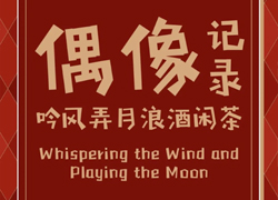
【也字工厂】山海明朝——宋体&黑体完美结合的美学系统
作者:也字工厂 编辑:字体天下&葱花
山海明朝体的核心创意在于从“竹子”处汲取的断笔效果。“山海明朝”家族字规划了三种可选择的断笔样式,这让字体的气质更通透、更美观。同时让平面设计师能更多元、更自由的进行版面创作。
The core creativity of Shanhai Ming Dynasty style lies in the effect of broken strokes drawn from "bamboo". The family character "Shan Hai Ming Dynasty" has three optional styles of broken strokes, then the character is more transparent and beautiful. At the same time, it is free for graphic designers to create layouts with more variety and freedom.

这也是冶字社推出的第一款精品字体,耗时半年打造。以山为界,描绘山河:以海为媒,拨弄潮汐;以竹承载,传承历史。取“山海明朝”也是在鞭策自己,胸怀山海,虚怀若谷,真诚造字,精益求精,打造跨越时代存在的字体。
This is the first boutique font launched by Yezi Club, which took half a year to create. Taking mountains as boundaries to depict mountains and rivers: using the sea as a medium to fiddle with the tides; using bamboo as a carrier to inherit history. Taking the "Shan Hai Ming Dynasty" is also a spur to oneself, with the mountains and seas in mind, with an open mind, creating characters with sincerity, striving for perfection, and creating a font that exists across the times.
宋体字迹清晰、疏密适当,黑体横平竖直、抢眼醒目。宋体和黑体是两种不同的结构和美学系统,前者具有古色古香的视觉效果,长时间阅读不易疲劳,适合做正文排版;后者字型端正,严肃但稍欠美感,字号小的黑体清晰度较差,因此更适合用于文章标题排版。
The Song font is clear in handwriting and appropriate in density, while the boldface is horizontal and vertical, which is eye-catching. Song font and Boldface are two different structures and aesthetic systems. The Song font has an antique visual effect and it is not easy to be tired after a long time, so it is suitable for text typesetting. The Boldface is upright font, serious but slightly less aesthetic. Which is small size of the black font and less clear. So it is more suitable for article title typesetting.
结合两者优点,我们希望山海明朝体给人的视觉感观是大气的,端正且富有趣味性、醒目易读却不呆板。既能满足用于标题字,也能在正文排版中使用。
Combining the advantages of the two fonts, we hope the visual perception of Shanhai Ming Dynasty style is atmospheric, upright, interesting, eye-catching and easy to read but not rigid. It can not only be used for title words, but also can be used in text layout.
山海明朝体在黑体架构上加入了宋体的衬角装饰,并对衬角造型进行了大量优化,切掉点、撇、捺、钩等笔画的尖端,调整撇、捺的整体曲率和笔画长度,适当减少宋体柔美的书写特征,保留黑体硬朗的转折特点。在理性的框架中融入感性,协调两者之间的特征占比。
The Shanhai Ming Dynasty style has been added the lining corner decoration of Song font to the boldface, and has been made a lot of optimization on the lining angle shape, such as cutting off the tips of strokes such as dot, skimming, stroking, hook, etc… Adjusting the overall curvature and stroke length of skimming and stroking, reducing the soft and beautiful writing characteristics of the Song font appropriately. Retaining the tough turning characteristics of the boldface. Integrate sensibility into a rational framework and coordinate the proportion of features between the two.


在山海明朝体的创意阶段,我们倾向于关注字体的实际应用效果。从平面设计的艺术效果和实用效果来考虑,一是做标题需要醒目和美观,二是字体本质即传达信息的功能,识别度要高。
In the creative period of Shanhai Ming Dynasty style, we try to focus on the practical application effect of fonts. Considering the artistic effect and practical effect of graphic design, one is that the title needs to be eye-catching and beautiful, the other is the essence of the font which is the function of conveying information, whose recognition degree should be high.


本文为字体天下原创文章,转载请注明出处

现代文字载体的嬗变,经历了铅与火的洗礼,光与电的淬炼,迎来了数字屏显时代的进化

字体推荐|综艺常驻,追星必备——方萌

Aa先锋宋新字上线|在世界的底色里,写一首具体的诗

字魂 × 紫禁文创重磅发布「字魂丹宸榜书」,赋能传统文化 IP焕新

字魂×腾讯《穿越火线》定制字体上线!打造沉浸式枪战世界